Summary:
Overall, the advanced excel visualization tools are touched in this project and used accordingly.
Features | Skills |
Customized Waterfall Chart, Stacked Bar Chart, Customized Line Chart, Map Chart, and Combo Chart | Advanced Pivot Charts |
Doughnut Chart with textbox inserted that displays data real time | Advanced Pivot Chart, Excel Function [Getpivotdata] |
Slicer | Advacned Pivot Charts, filtering |
Interactive Buttons (info button and tabs) | VBA |
Interactive Setting (customized color theme selection, on/off setting for tabs and info buttons) | VBA |
Introduction:
•
This project was initiated in an attempt to upscale the level of data visualization skills in Excel
•
The objective is to provide advanced data visualization dashboard of customer data from a company operating in US using Pivot Table, Pivot Chart, and VBA.
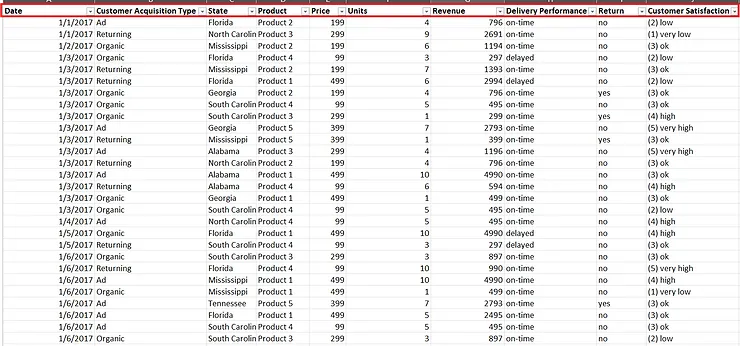
Dataset:
•
The dataset had 5782 features with 10 different categories
◦
Categories: Date, Customer Acquisition Type, State, Product, Price, Price, Units, Revenue, Delivery Performance, Return, Customer Satisfaction
Exploratory Data Analysis
Data Cleaning:
Data Cleaning Checklist
1. Are the data's width and row allocated perfectly?
2. Are there any unnecessary names and words that need to be replaced?
3. Are there any disturbing capitalized data that needs to be in lower-case?
4. Is all the data organized being easy to read and analyze? (e.g. unnecessary spaces)
5. Is there any data that needs to be split?
6. Are there any duplicates?
7. Are there any blank cells?
8. Are there any error cell?
9. Is the header formatted well?
10. Turn and turn-off gridlines to see the data more clearly.
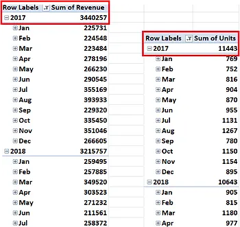
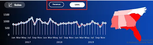
Sales by scale of revenue and number of sold
•
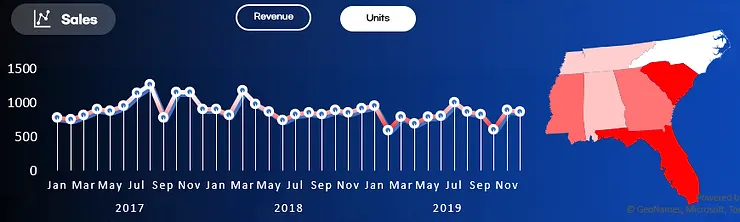
Calculated 'Sum of Revenue' and 'Sum of Units' based on Years and Months
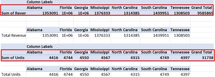
Sales by States
•
Calculated 'Sum of Revenue' and 'Sum of Units' based on states in US.
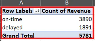
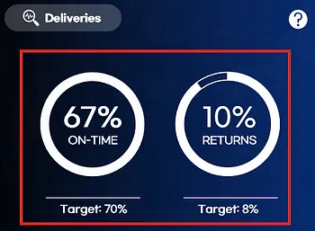
Delivery Performance
•
Count the number of 'Delivery Performance' of the company of which divides into either 'on-time' and 'delayed' deliveries.
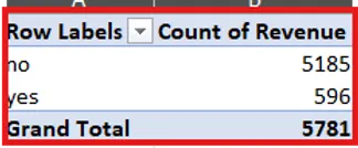
Return Rate
•
Likewise, count the number of 'Returns' of which divides into 'no' and 'yes'
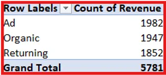
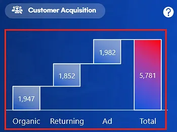
Customer Acquisition
•
Count the number of items sold by one of three customer acquisition method:
◦
Advertisement, Organic, Returning
Customer Satisfaction
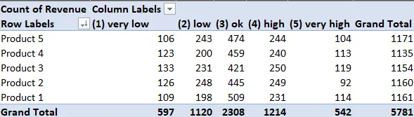
•
Count the customer satisfaction of each products in five different scales.
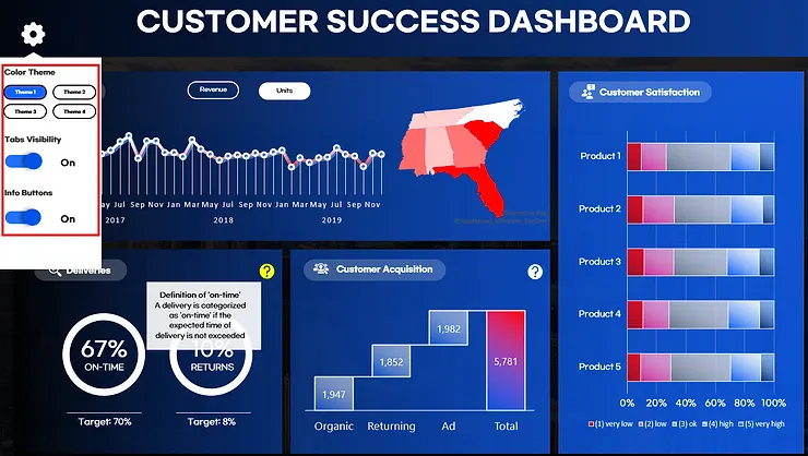
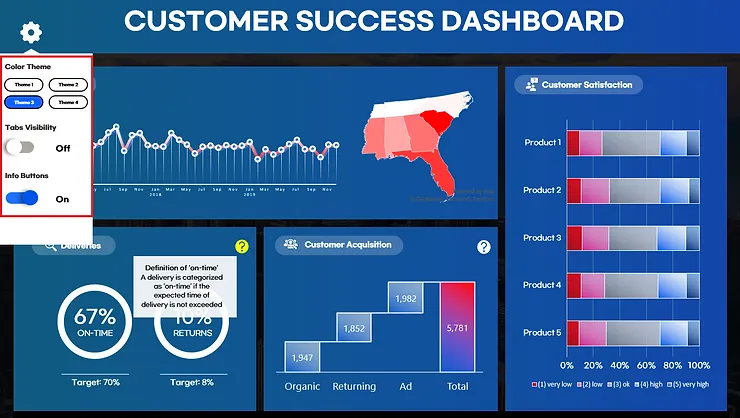
Visualization & Dashboard:
•
Line & Map Chart for Sales
◦
Line Chart added gradient scale of line that emphasizes the point of which the revenue or units sold heavily dropped.
◦
Map Chart highlighted the states with gradient scale of which the intensity of the color represents more items sold.
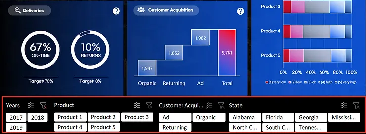
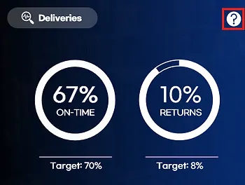
•
Doughnut Chart for Delivery Performance
◦
67% of deliveries were made on time and recorded only 10% of returns
◦
The chart included target performance of the company to check directly whether the performance is satisfying or not.
•
Waterfall Chart for Customer Acquisition
◦
Total 5,781 customers were acquired. There were no distinctive differences between each methods of acquisition.
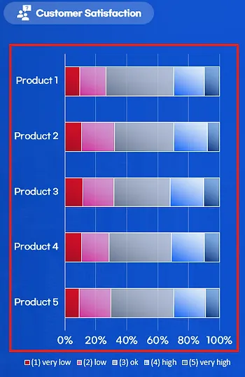
•
Stacked Bar for Customer Satisfaction
◦
Product 2 and 3 had lowest satisfaction rate.
•
Slicer for Filtering the data based on desired features
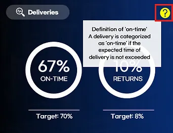
•
Interactive Buttons within Charts
◦
Instead of slicer, VBA supports more smooth interactive features.
•
Setting Features
◦
supports simple customization from viewers easily
◦
provides four different color themes of the dashboard
◦
can turn on/off interactive buttons of the charts